In HighGear 9.2.1 it’s all about empowering data clarity with scheduled dashboard emails and brand-new dashboard features.
Your team can now share regular insights and visual progress updates with clients, executives, and other stakeholders via email. New dashboard chart types, gauge display options, and currency symbols also make it easier than ever to highlight the trends and patterns that matter across your dashboards.
- SaaS customers will be upgraded to version 9.2.1 on the following dates:
- Early Access: 10 PM ET on Saturday, February 2nd
- Mainstream: 10 PM ET on Saturday, February 16th
- For support, please contact Support@HighGear.com.
- For additional licenses or services, please contact Sales@HighGear.com.
New Dashboard Features
Email Dashboards on a Schedule
HighGear dashboards can now automatically land in your stakeholders’ inboxes on a recurring schedule, giving designated contacts a snapshot of dashboard charts, graphs, and summaries of list results without manual work.
HighGear’s new dashboard emails are designed to look professional on mobile devices and computers. Anyone with an email address can receive these updates. That means clients, partners, and top-level executives can now be kept in the loop, whether they’re licensed HighGear users or not. It’s as simple as setting the schedule, designating the contacts to receive the updates, and letting HighGear handle the rest!
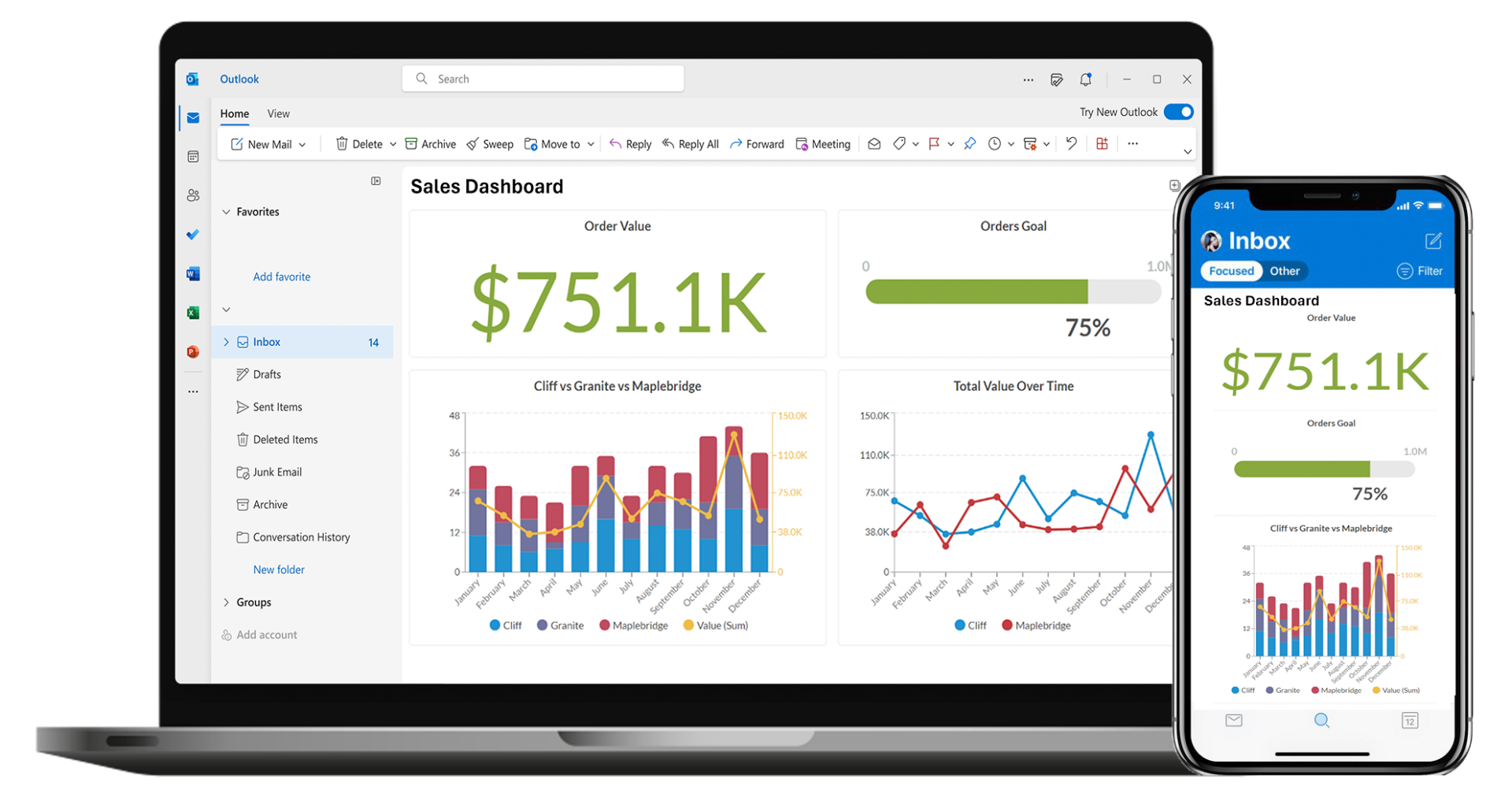
New Dashboard Chart Types
Task Dashboards have been enhanced with several exciting ways to display charts that satisfy the growing needs of data-driven organizations.
- Line Charts: This chart type makes it easy to visualize relationships in data over time.
- Stacked Column Charts: Column charts can now be configured to display series stacked vertically rather than showing them side-by-side.
- Area Charts: Useful for displaying changes in data with more color. It can also be stacked to display several series of data in the same chart.
- Composite Charts: Line charts can be layered on top of other chart types to display more information in one visualization.
New Display Options for Gauges
HighGear has added new ways to show data in gauges! Expanding on the popular Digital and Analog display modes, HighGear gauges can now also be formatted to represent data via a sleek progress bar visualization. In addition, you can now choose to display gauge values as a percentage rather than the whole number to provide an at-a-glance view of important objectives. These new options make it easier than ever to convey clear goals to the organization.
New List Option: Hide Project Hierarchy
Based on valued customer feedback, seeking to further optimize for certain work types and users, we have added a new list grouping option that allows project hierarchies to be hidden. This can simplify the list display and eliminate the need to expand projects to see the desired records.
Other Enhancements
Enhanced Currency Representations
Administrators can now configure numeric textbox field formatting to include a currency symbol before or after a number. That symbol will be visible everywhere the field is edited or displayed in HighGear, including in dashboard visualizations, to help currency fields stand out in dashboards and forms.
Updated System requirements
HighGear no longer supports Windows Server 2012 R2.